Mobile Website Updates 5-26-16
Why Is This Important?
- 51% of website visitors are using a mobile device!
- 50.15% of leads generated in April 2016 were using a mobile device or tablet!
This trend is continuing, and the percentage of mobile traffic is only going to increase as mobile device usage becomes the preferred device of home shoppers. Our consumer team is committed to giving your clients the best possible experience, and a huge part of that is doing constant usability testing to find new ways to make our sites more engaging. More engagement = More Opportunities for you!
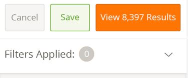
Mobile Menu
The first major change is that our menu is now full screen width. This provides a larger view, and eliminates confusion with the back arrows. A cancel button was added to exit the menu, and go back to the properties.
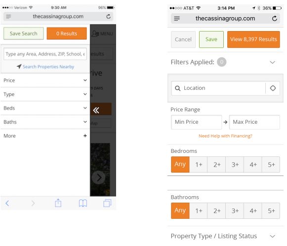
Next instead of stacking up search “pills” we’ve added them behind a “Filters Applied” drop down. This enables a cleaner view when lots of search criteria are added, and keeps the menu from being pushed down.
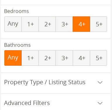
Bed and Bath’s are now no longer hidden in drop down menus. We’ve made them much easier to access right away. These are some of the most commonly applied filters consumers use, and results in a lot less taps and confusion.
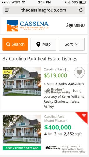
New Property Cards
Finally we’ve updated the mobile property cards. This update includes a revised favorites button to allow more room for information to display, and we implemented easier to see fonts, and bolding around Price, Beds, and Baths.
All of these changes add up to a much nicer experience for the user with less taps, and it helps them quickly find the home they’re looking for. Stay tuned for more regular updates on this blog to keep informed of all the ways we’re working to make your websites better everyday.